Case Study UX/UI

Nomad Camp
Desktop Website

Creating an enjoyable shopping journey

Tools Used
Figma
Pureref icon
Pureref
Pureref icon
Photoshop
Pureref icon

Project Overview

Product icon for case studies.

The Product

Nomad Camp is a retailer, with both an online store and physical locations across Australia, that caters to outdoor enthusiasts and weekend adventurers. The brand offers a wide range of products, including footwear, hiking and outdoor clothing, fishing equipment, and 4WD accessories. Due to the broad range of outdoor hobbies and products they sell, Nomad Camp appeals to a wide range of potential customers. The target demographic is individuals aged 17 to 75.

Pain point icon for case studies.

The Problem

People interested in outdoor goods come from various age groups, and the older group of users have limited experience with online shopping due to not growing up with e-commerce websites in their earlier years. As a result, this makes it difficult for older users to understand the shopping journey, the navigation and purchasing products with confidence online. A large percentage of campers in Australia are over the age of 50 or older being 46%.

Source: https://camperchamp.com.au/camping-statistics/

Target icon for case studies.

The Goal

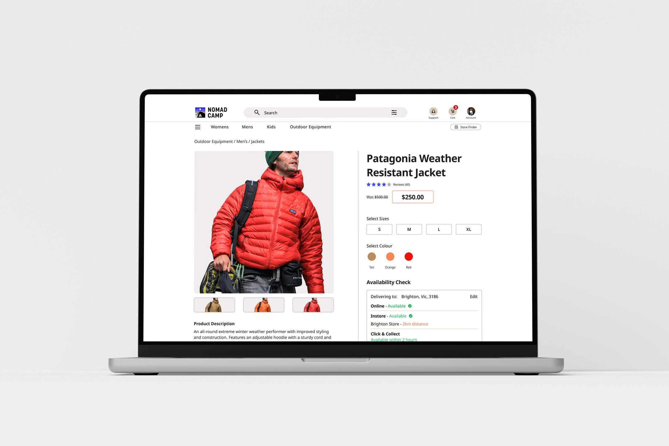
My primary design goal is to create a website that offers intuitive navigation for all users, including those who are less experienced with online shopping or are of varying ages. The aim is to enable effortless product browsing and a seamless purchase process, minimising any potential frustrations.

Project Role

This project was an individual student endeavour. Following the design stages of the UX product lifecycle has enhanced my planning and research skills.

Visual Design & Prototyping
Empathy Mapping
Personas
Planning & User Research
User Flow Maps
Wire-framing

Competitor Audit

My competitor analysis included indirect and direct competitors in the camp supply industry. The focus on the comparisons were based on, consistency of design, accessibility, features, user flow, navigation and clarity of information shown. I viewed the competitors mobile and desktop website to get a feeling for what was working and what was not.

Macpac

Language - Outstanding

  • Descriptions are clear, concise and professional.
  • Product features are easy to read in bullet point format.

Features - Good

  • Has expected features for online shopping such as, quick view, store locator, filtering system, delivery option section and size guide.

Brand Identity - Outstanding

  • High quality images used throughout the website.
  • Consistent brand design style used throughout.

Navigation - Outstanding

  • Easy to navigate to sub-categories in menu with icons making it easy to scan for products.

Anaconda

Language - Good

  • Simple clear language used.
  • Product overview text consists of slightly long paragraphs.

Features - Outstanding

  • Has plenty of features for online shopping including, size guide, store locator, wish list, delivery availability section, stock level indicator, and guest checkout.

Brand Identity - Needs Work

  • Imagery quality of products could be improved.
  • The design asspects of UI elements feel dated.

Navigation - Good

  • Navigation dropdown menus are easy to use with logical information architecture sorted into appropriate groups.

Accessibility - Needs Improvement

  • Screen reader works on most of the imagery on home page. But with some images on the website alt text is missing for screen reader.

Aussie Disposals

Language - Needs Work

  • Feels too text heavy in some sections of the website.

Features - Good

  • Has suitable features for the online shopping experience such as, delivery availability, clear specifications, different methods of payment, and store locator.
  • For bulky items there is a note that delivery is not free. This is a good way of preventing frustration and surprises for customers on pricing.

Brand Identity - Needs Work

  • Too many colours used throughout the website which does not give a consistent brand look.

Navigation - Needs Work

  • Too many options on the navigation bar for main categories, this can make it difficult for users to make decisions. There are 12 main categories.
  • Animation doesn’t add to the experience on dropdown menu as it feels clunky and awkward.

User Flow - Needs Work

  • The user flow could be simplified a bit more as there are some pages that feel unnecessary. For example, when clicking on fishing doesn’t go straight to the fishing section, goes to a page with fishing categories. The filter within product page menu can narrow down the search, so it feels like doubling up on something.

Accessibility - Needs Work

  • Doesn't work on product imagery when using screen reader.
  • Screen reader doesn't read out icons at footer of website.

Decathlon

Language - Good

  • Clear and concise information on product overview information

Brand Identity - Good

  • High quality imagery used across website.
  • Consistent colour usage across website elements, including call to action, stock levels, and discounts.

Navigation - Good

  • Navigation is easy to use with logical information architecture.
  • Important links are all visible in navigation section.

User Flow - Good

  • Easy to follow shopping journey and has alternative methods of signing in using Google or Apple.
  • Numbering system of steps makes easy to understand what steps are to follow in checkout process.

Accessibility - Okay

  • Screen reader works on product imagery on website.
  • Images are unintentionally resized by screen reader extension altering image size on website, when hovering over image for audio. This is some sort of compatibility issue that I haven’t seen on the other websites.
  • Screen reader works on navigation bar icon.

Empathy Mapping

Aggregated empathy map from user group interviews. Collecting information from different potential users based on thoughts, feelings and behaviours.

User Research Summary

The research method that was chosen for usability research was, moderated study guiding the user through prompts in person. My aim from the study was to discover the thinking habits of users completing a purchase from start to end. In addition to draw out areas of required improvements in the main user flow from participant responses. During the synthesis process I chose to do qualitative research.

Pain point icon for case studies.
Pain Point

Products taking longer than expected to be delivered.

Pain point icon for case studies.
Pain Point

Forms that aren’t clear to fill out

Pain point icon for case studies.
Pain Point

Being overwhelmed by the amount of products displayed on screen.

Pain point icon for case studies.
Pain Point

Certain products not displaying enough information or easy to understand.

Personas

Charlotte Smith persona.John Smith Persona.Greg Townshend persona.

User Journey Map

User journey map for website.

Site Map

Here is basic overview of the information architecture for Nomad’s website content. Attention was taken to reduce the page count of main categories on the navigation bar, to reduce the chances of confusion for the user deciding which link to select.

Site map for Nomad Camp desktop site.

Wireframes

Wireframes for main user flow pages drawn up after initial user research for Desktop website. While completing wireframes consideration was made for users, to navigate to products of interest as efficiently as possible with more than one way of navigating.

Wireframe for main page.
Lo-Fi Wireframe: Main product page header section and featuring product category layouts.
Lo-Fi Wireframe: Layouts for customer log in page.
Lo-Fi Wireframe: Ideas for product overview page showing placement of thumbnail imagery and important product specifications areas.

Digital Wireframes

When I began the low-fidelity digital wireframes I kept in mind the research from the competitive audit findings. The pain points and frustrations from other existing online stores collected by interview participant responses.

Digital wireframes of desktop pages.

Low Fidelity Prototype

Usability Study Findings

Finding
  • Label text was too small to read on checkout progress bar below icons.
  • Delivery types did not indicate how many working days each option would take on delivery options page.
Finding
  • A suggestion was made that it would be useful for some users to include a print order button or save as pdf, when order has been completed.
  • Billing address option not included on payment page.

Mockups

Before Usability Study

Based on feedback from the usability study participants, I made the following changes to the store website. The order summary is now visible throughout the entire checkout process. The billing address field has been added to the payment method page.

After Usability Study

Before Usability Study

After Usability Study

Improving the functionality of the confirmation page allowing users to immediately save or print order receipts via website. Colour thumbnails were added next to product information for easier reading.

Accessibility Considerations

Tick icon for case studies.
Accessibility

UI components were checked using WCAG that colours meet AA Compliance.

Tick icon for case studies.
Accessibility

Plenty of spacing between sections to allow users to decipher different sections within site.

Tick icon for case studies.
Accessibility

Labels under icons for screen readers and for users to easily understand icons who may not be familar.

Nomad Camp black hoodie.

High Fidelity Mockups

Main page laptop and mobile mockup.High fidelity mockup of log in.High fidelity mockup of men's jackets.High fidelity mockup of product jacket page.High fidelity mockup of my cart information.High fidelity mockup of my cart.High fidelity mockup of delivery options.High fidelity mockup of select delivery address.High fidelity mockup of order review order.High fidelity mockup of payment method.High fidelity mockup of order confirmation.

High Fidelity Prototype

After refining the low-fidelity prototype, I worked on the final designs with a main goal keeping the interface as simple and clear as possible across the website pages. The colour scheme I used across the website was inspired by nature’s natural colours. I chose to use a white background for Nomad’s site to keep a clean and modern look.  

Takeaways

Participant Quotes

“I like that I have the opportunity to go back if I have made a mistake.”

“I feel comfortable with this page, as its spaced out and very easy to understand.”

Man fly fishing on river in water.
Clothes on wall in shop.
What I Learnt

Completing the Nomad Camp’s desktop website I have become more confident in creating sitemaps and wireframes. I have built a greater awareness of the finer details of UI elements for a checkout interface design.

Sunrise and tent on mountain.

Next Steps

Obtain further feedback from industry professionals in UX/UI or design.

Potentially to make revisions to the design from
e-commerce site research in the future.

Personal project signature with contact details.